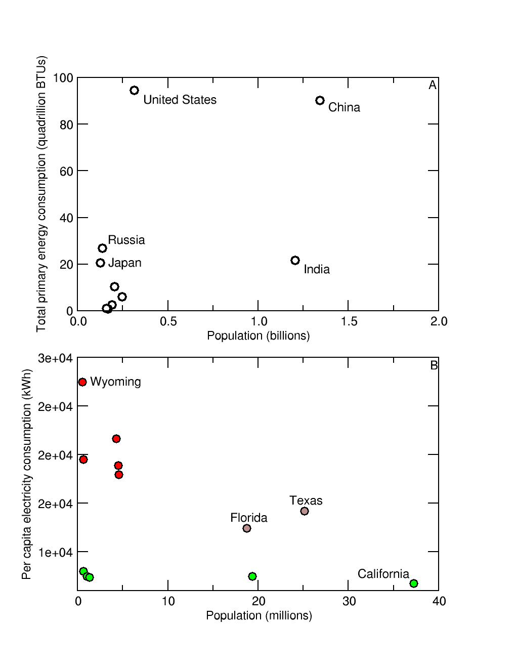
 This is a draft figure from an essay that I've been working on recently (use your browser to "view image" for a larger size). It is a very simple illustration of (1) the irregular relationship between population size and energy consumption, and (2) the variation of per capita rates of electricity consumption among American states. Here is a relevant excerpt from the text of the essay:
For example, globally the United States ranks first in per capita energy consumption (Figure 2a). Yet, among US states California, the most populous state in the union, has the lowest per capita rate of electricity consumption while Wyoming, with a population 66 times lower than California's, has the highest rate (Figure 2b). Climatic differences account for some of this disparity, with Wyoming having amongst the coolest summer and coldest winter temperatures in the US. Climate alone cannot account for all the variance, however, because California also has two of the top 10 hottest major cities in the country, along with other populous states such as Texas and Florida. Neither of the latter states is in the top five consumption group. On the other hand, other states in the top five group, such as Kentucky, do not have particularly extreme climates, nor large populations, and therefore have considerable room for reducing per capita energy consumption rates while maintaining high standards of living.
Figure caption: Energy consumption rates. A – Total primary energy consumption of the world's 10 most populous countries (China, India, United States, Indonesia, Brazil, Pakistan, Nigeria, Bangladesh, Russia, Japan), 2009 (BTU = British thermal unit). B – Per capita electricity consumption, United States, 2010. Red – five most highly ranked states (Wyoming, Kentucky, North Dakota, Louisiana, South Carolina), green – five lowest ranked states (California, Hawaii, Rhode Island, New York, Alaska). Florida and Texas are in neither group, but have both high populations and climate extremes.